Tripadvisor: Usability Evaluation & Site Redesign
Taj Mahal in India is listed as one of the Seven Wonders of the World, is also one of the favorite destinations for couples. Before going on vacation, travelers need to check everything from A to Z on the traveler websites.
For this challenge, my mission is to resolve a usability evaluation and site redesign by using a heuristic approach. A heuristic is a fast and practical way to solve problems or make decisions.
The Methodology
User type

The young couple between 20–40 y/o. They both saved enough for the tickets and are planning to save as much as possible for the next 6 months to do this trip. They want the trip to be organized from A to Z, experience new culture, and enjoy their one of the bucket list’s wanderlusts.
Taj Mahal is a love tribute, a symbol of love, and a long-odds monument in the world which nothing to compete its grandeur, for its beauty, and for its mystique. That is why Taj Mahal is one of their wanderlust bucket list.
Research
Travel guidance for young couple. Everything they need to know and important information about the destination.
- Nearest airport to destination: Indira Gandhi International Airport, New Delhi / Sahar International Airport Mumbai Airport
- Currency and exchange: 1 EUR = 87.05 INR (Indian Rupee)
- Vaccination/visa: All tourists visiting India need to get vaccinated for hepatitis A, tetanus, and typhoid. In addition, they will need to take malaria tablets to prevent getting infected on your holiday. E-Visa could be applied at the Indian embassy.
- Wardrobe recommendations: Casual modest wardrobe.
- Days needed to visit attraction: Between 9–15 days (to explore more than one city)
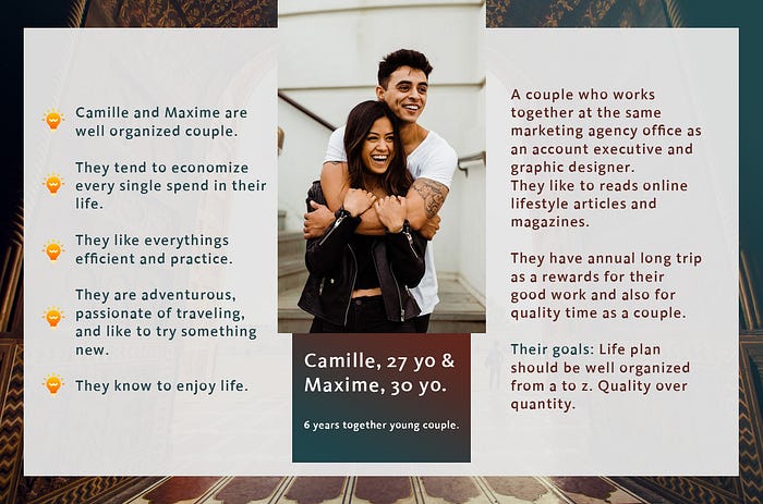
Here is the persona that I created:
Benchmark
To process a benchmarking, I used the usability heuristics evaluation principle by Jacob Nielsen to compare the online travel companies such as Skyscanner, Kayak, and Tripadvisor. After analyzed three of them, I choose Tripadvisor that suits better to the persona.
Tripadvisor has the most complete principles which are:
- Visibility of system status
- Match between system and the real world
- User control and freedom
- Consistency and standards
- Flexibility and efficiency of use
- Aesthetic and minimalist design
- Recognize, diagnose, and recover from errors
- Help and documentation.

Testing
I proceed this step by testing and interviewing 4 users (2 couples). The results are:
- For the look and feel, they see first an illustration image that was attractive, then, since they knew already this tool they said that this tool is one they need when they want to find the information about their destination and buy a ticket by clicking a menu with an airplane icon. They use Tripadvisor basically to find things to do and restaurant reviews.
- Budget: 3500 EUR /person all in for 12 days trip.
- Accommodation: 3 stars hotel
- Transportation: Car rental or taxi
- Schedule preference: Time restriction and some flexible days
Insight
Pain problem:
- In general, user flow is not fluid, the users should take time to navigate the website as so many choices that can make it hard to prioritize the information of what they need.
- It’s not easy to find an accommodation in the preview section that suits well the users as too many information such as; compared price, accommodation facilities, and partners logo that confused users and need to find one by choosing a place based on a map.
- For users who are the good deal flight hunters, it also takes time to find one. Filter button use the words that they think it can be easier to understand.
Expected goals:
- Fluid user flow, so that the users could understand and get quickly the informations by simplify and organize the features section on a homepage.
- Prioritize the main information and put a bigger map section.
- Categorize the cheapest and fastest flight on the first option.
Redesign
To resolve the main pain problems and reach out to the goals, I’m going to redesigning Tripadvisor website that going to be more simple, clean design, and straightforward.
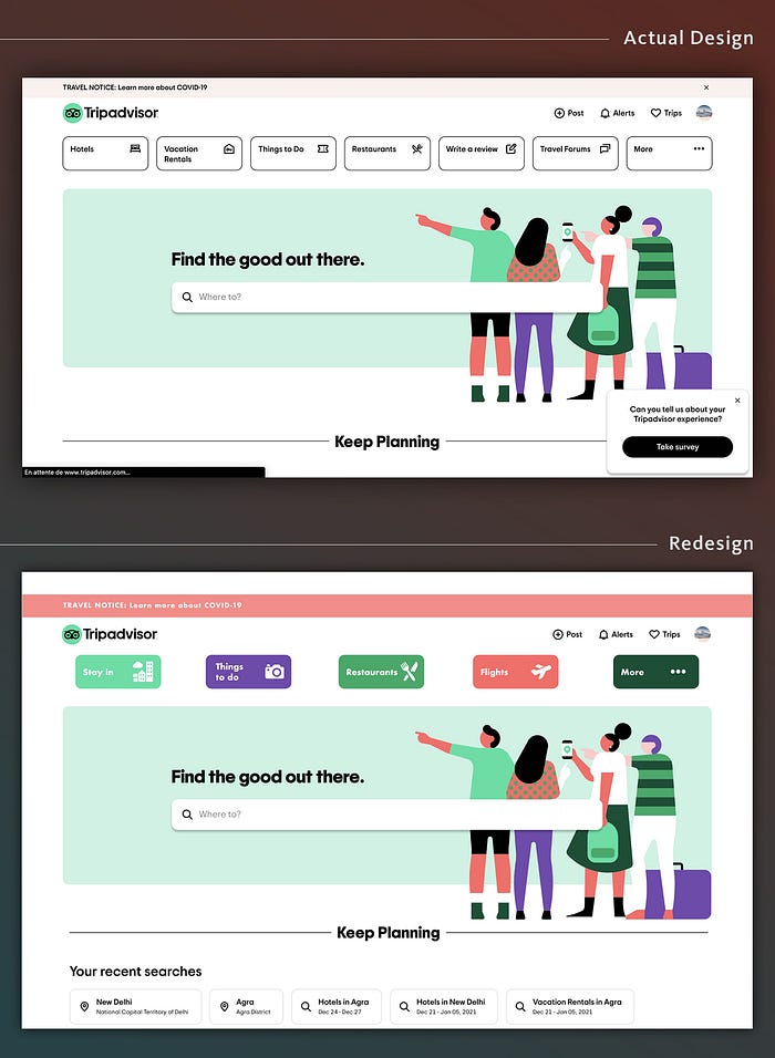
➡️ Homepage: Reorganize the main features, and separate them by color icons.
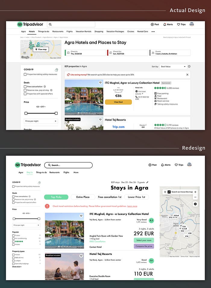
➡️ Stay in feature: Simplify the UI design and bring up the selected main information. Hotel details will appear on the other page.
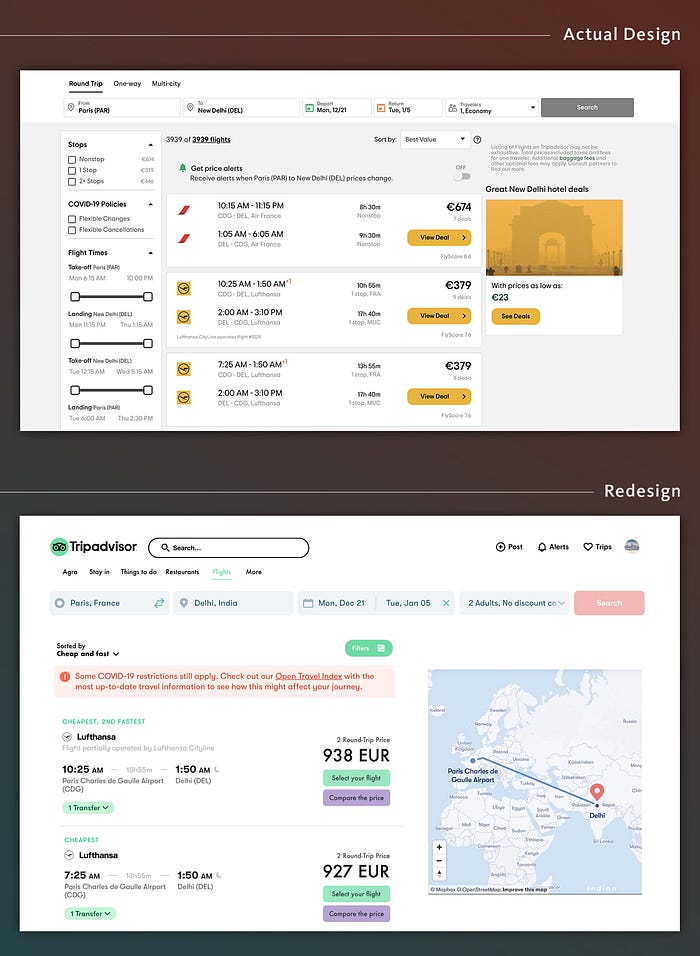
➡️ Flights feature: Simplify the UI design and categorize the cheapest and fastest flight on the first option.
⬇️ Interactive prototype ⬇️
📝 Learning testimonial 🤓
This complex methodology to do Usability Evaluation & Site Redesign was so challenging. I learned to decomposed all the points to lead me to the right UX in my version to evaluate and redesigning a big company website, I learned to understand every single heuristic principles that actually a pillar to be a UX/UI designer. Can’t wait to have more project like this!
